By Michael Courtney
 This is a story about our firm’s experiment to evaluate the success of a wildly popular project and translating that success to show the power of a placemaking element to other organizations.
Instinctively, professionally, we can see a project is working and we get similar feedback from our clients, Yet, we (as professionals) often don’t attempt to evaluate its effectiveness. Two reasons come to mind: finding the evaluation tools has been elusive; or the client doesn’t show interest in collecting the evidence, and we move on to our next assignment. This project was an exception.
Backstory
In a meeting with the president of the University of Washington, our firm was challenged to design an element to connect with a broad range of people, “(via) a memorable, photogenic landmark, distinctive to the UW campus. Something visiting students and their families will remember, where we can bring staff we’re recruiting and where I can end my ‘Money Walk’ with potential donors by showing them a powerful symbol of the University.”
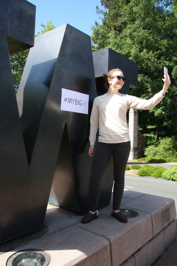 We proposed using the newly adopted school workmark and designed a seven-foot-tall “W,” placing it at the main entry to the campus. Our design was quickly approved and the Big W was fabricated, installed and dedicated in the Fall of 2010.
Our UW committee members initially worried about finding funding for the project. One of the members had contacted a group of alumni who were looking for a project to sponsor. After he showed them a sketch of the “W,” they quickly agreed to fund the landmark.
As we showed our portfolio to current and prospective clients, we began to hear stories: “Oh, you designed the Big W? Love it. My daughter (uncle, cousin, nephew, coworker, neighbor, spouse) has posted photos of themselves at the Big W on Facebook (Instagram, Snapchat, Google Imagess),” and “Did you know the UW is using photos of the Big W in its marketing collateral and videos?”
The Campaign
As we browsed the Internet, we saw hundreds of photos of the Big W. This showed us that our work had been successful and we began planning to evaluate the effectiveness.
We developed a student-focused social media campaign using Snapchat, and asked UW students to submit their favorite photos at the Big W. It was an easy and fairly inexpensive way to engage the students. They would select the filter for their snaps that they would be sending to friends. The filter itself featured a purple W (school colors) and the hashtag #mybigw.
The campaign was timed to coincide with the end of the school year and graduation, when families and individuals most often shoot photos at the landmark. We sat up a geotag at the Big W to make it easy for photographers to quickly upload photos on the spot.
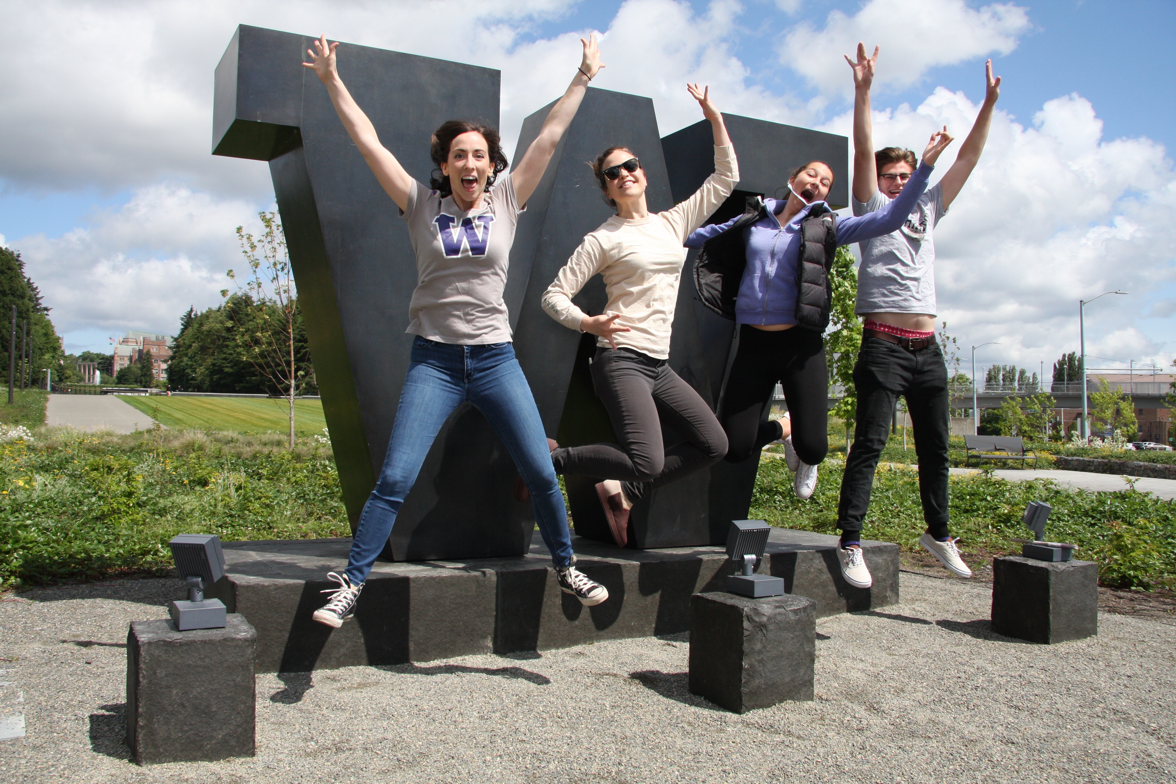
Success: we received photos ranging from sweet to enthusiastic, with indiviuals, groups of three and families with two or three generations of graduates posing together. Along with the photos were captions expressing what the university means to them:
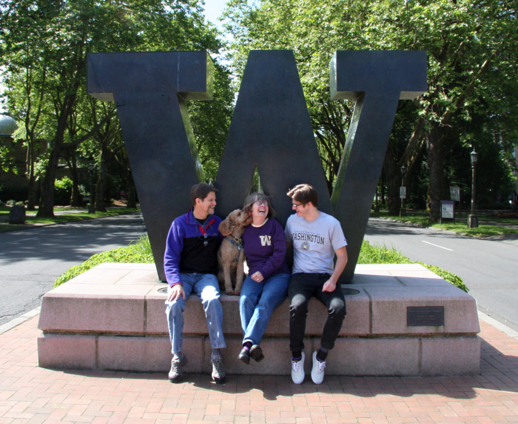 “The W icon personally means a tremendous amount to me. It’s something prestigious. I first remember seeing it on the Internet. Then it became something that I saw all the time when my family and I visited or picked up my older brother two years before I even began attending UW.”
And, “It was there for my very first day moving into the dorms and first day of school—and it is going to be there the day I graduate. It definitely will be one of the places I take a picture with my cap and gown.”
Summary
Design firms and clients alike want to know the effectiveness of a project and track the user engagement. Using social media engagement allowed us to evaluate success in meaningful ways.
The campaign received a variety of enthusiastic responses from participants and it was in the breadth and depth of those responses that we began to understand how powerful this project had been.
Whether they were a fifth-generation UW alum or a first-in-the family graduate, we realized that the Big W resonated with everyone in different contexts, facilitating connection, self-expression and a sense of pride in the university.
Michael Courtney is the principal of Michael Courtney Design. You can reach him at mike@michaelcourtneydesign.com.


