Handcraft, Detailing And Determination • The Journals And Journeys Of Tim Girvin
By Tim Girvin
 BEGINNING LA: 101
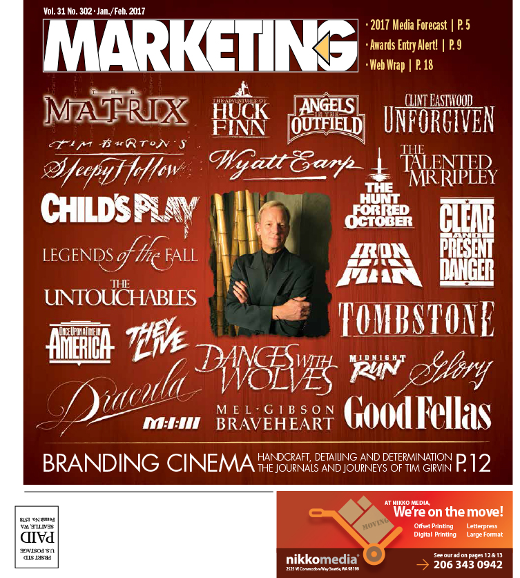
I started working on graphic identities and design programs for motion pictures in 1976, the year I started my agency—40 years ago. Francis Ford Coppola had seen some of my work in a design magazine and pulled me in to work on Apocalypse Now. That was the beginning. I had no idea what I was doing—I just drew using brushes on Japanese handmade paper—a big swath of renderings, based on what I knew about the film title. This was my first cinematic branding design assignment so I went with the flow. Most of these interpretations were roughly drawn vertical scripts and underlined signatures, spattered and rendered as a graffito, each a sprawling slash. He liked them.
WORKING IN LA
I was, and am, an outsider.
Most of the agencies that are working in the motion picture business in Los Angeles are located, in many instances, only miles from the production lots of the major Studios—Warner Brothers, Paramount, Universal, Disney—each has, in varying degrees, capitalized on touristic views with their properties. Universal has turned that strategy into a major enterprise. Disney’s Studios are not entertainment-focused—however, they’ve converted other locations to selling larger engagement, to the south: Anaheim, and to the East: Orlando—the American Disney parks.
Still, LA is big and broad, and as a metroplex, it’s a drive culture—people drive from many parts of the city to arrive, discuss and deliver work. And they fly in, even from Seattle—I’d fly in and drive around LA, to a litany of appointments. presenting and discussing work with directors, actors, studio VIPs and studying cinematic style with the production designers on set, on the lots. However, to be in the movie business: proximity is huge. For design, advertising, integrated media, buys in print and outdoor, it’s too 11th-hour, it’s too crisis motivated to be remotely located.
I flipped that orientation by specializing in projects that were difficult, had more challenging strategy or design expectations, obstreperous directors, production teams, agents and talent. Later, they’d simply ask for me to be involved. And a lot of that work became customized typography, hand-built fonts and creative journals of design thinking.
MOVIE BRAND DESIGN JOURNALS
In the later years of working in Hollywood, my approach came down to the following sequence:
Movie call?
Get down there. Talk live, meet the people, visit the set, study production drawings and storyboards, look at dailies and check out the stills—as well as read the script [sometimes a numbered script with your name in the numeration, and on the lot in a locked room].
Formulate a strategy?
Build a strategic journal—design and pull together words, imagery and direction—with drawings modeled on the learnings, interviews and shooting results of being there as well as ancillary research. In most of the complicated studies that we did—a journal overview was part of our presentation—words, ideas, drawings, poster concepts and logos, as well as copy and positioning thoughts for the film. It’s worth acknowledging that motion picture design work is split between union-controlled work, such as directors, casting, set design, and the non-union outsider agencies that work almost entirely on theatrical advertising—posters, sites, in-theater stanchions [standees] and promotional collateral.
And then there was “me.” Sometimes I was working with directors [Clint Eastwood,] sometimes with stars [Tom Cruise], sometimes with producers [Joel Silver]—to each, an array of stories—and over time, hundreds of logo projects, mostly very small budgets coupled with the spin of an incredibly fast turnaround.
“Can you be here tomorrow?”
Sure.
Brand. Story. Design.
The entire premise of the nature of giftable content presumes that there is something worth sharing—or that the telling of the tale, visually or textually, is a profoundly emotional recounting and unforgettably compelling spin. And ultimately, all the most powerful design—the describing and signing of ideas—will come back to that journey:
“Were you there? Do you know what story needs to be told?
Could you visualize it, or rewrite it in a manner that would purvey memorability?”
Will people care?
Sync it up: linking utility in relevance, vibrating resonance and magnetism, and finally, the third R in this alliterative contemplation: relationship.
DESIGN HOLISM + BRAND INTEGRATIONS
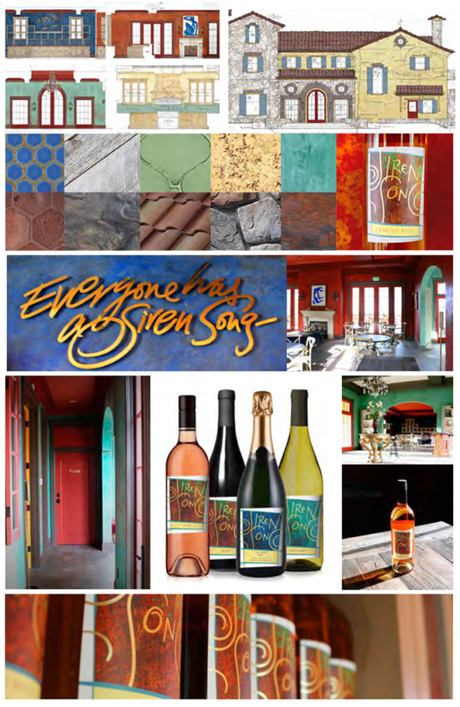
Sometimes, it’s the relationship of persistence and commitment that builds resonance. In that vista, we think about our work for Kevin and Holly Brown, the founders of Siren Song Wines, Lake Chelan. They had a dream, a visioning —we helped them get there. Make it real and livable. It wasn’t about the design of a brand as a theoretical operational and product ideal, it was about linking the spiritual and tactical theses with built design and placemaking.
We offered strategy in the form of a continuous journal-making that was an iterative evolution, a möebius strip of dreams, visuals and words to materials, furniture and colorations—and from this—labels and identity. We took that journey of design thinking and flipped it. We pursued dreams and visions for interiors. Then built design and brand on top of the place-making and experience strategies.
THE FLOWERS THAT OPEN ONCE
MIGHT OPEN AGAIN

To the nature of storytelling brand and design—there might be a story in a story—that goes round—and comes back. I worked on and drew the logo for Kettle Chips in 1982. Packaging flowed from that well-known mark, crafted by hand, metal pen on handmade italian paper. Then it came back—and for the last several years, while the brand was owned by Diamond, GIRVIN returned as agency of record. In the spirit of spectacle and experience design, the same premise holds. Make it unforgettable.
Pub Note: Tim Girvin’s impressive body of movie-title work is one of Seattle’s best-kept secrets. The striking cover by GIRVIN designer Michael Kennedy is intended to rectify that situation. Tim is celebrating the 41st anniversary (i.e., beginning the fifth decade!) of his Seattle-based GIRVIN design firm in 2017.


