


By Tyler Cartier
 When people consider “brands,” they often think of a logo, corporate colors or the visual vocabulary. For example, Google’s colorful letters or the Starbucks mermaid.
But a brand’s voice can be just as powerful and differentiating. The trick is to identify an organization’s authentic, own-able point of view and then reflect that spirit, not just by “what” you say, but “how” you say it.
Case in point. Over the past 15 years, I’ve had the good fortune to work with the Space Needle on hundreds of marketing projects. There’s a lot of “there, there” with the Needle. As a unique and globally recognized icon, it gives writers real traction when tasked with expressing its distinct point of view. Literally.
A few years ago, the Space Needle’s marketing team, led by Karen Olson, asked me to develop a brand book to capture the Needle’s persona on every level. Multiple internal logos define “the vertical village,” from SpaceBase retail to the Odeck to SkyCity Restaurant.
But what we really wanted to express was the essence of what makes the Needle so special, beyond the brand buzzwords of “authenticity and heritage.”
We were after a voice that energized employees and partners to embrace the Needle’s cool factor. And how important it is to express that voice accurately and consistently.
Digging deep, we arrived at two key differentiators the Needle owns and defines to the world: 1) unbridled optimism; and 2) quirky sophistication.
The first harkens back to its genesis as a civic monument to the 21st Century. People generally were excited about what the space age would bring. One of the Needle’s brand pillars would be to exemplify this positive, forward-thinking and upbeat POV.
The second pillar of “quirky sophistication” is embodied in the structure itself. It’s truly one-of-a-kind. Essentially, it’s a flying saucer (with a rotating restaurant) mounted on three tapered legs. But there’s also a sophisticated, mid-century modern look to the structure. Still smart and stylish after 55 years.
The completed brand book reflects mid-century optimism. Yet it doesn’t lose the quirky magic that makes the Needle such a loveable icon. The brand voice is upbeat, informative and fun, with a wink of what defines the Needle to the world. And will continue to define it with consistent application.
Several months ago, a representative of Pac-12 Networks came across the Needle brand book. Inquiries led them to me and the graphic designer with whom I partnered, Anthony Ferreira.
Pac-12 Networks also was looking to capture its unique heritage and POV. They wanted to go beyond simply codifying brand elements to express them in a way that their partners and internal team would read and and take to heart.
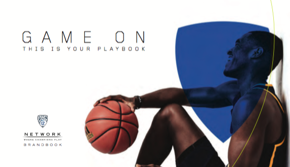 As with the Needle, the goal was to capture the essential spirit of the Pac-12, the “Conference of Champions,” and the Networks team that brings that heritage to life.
The brand voice reflects the DNA of the organization, including its commitment to excellence and success, both on and off the field. Athletic prowess is rooted in action, balance and timing. Thus, we used short, punchy sentences. Inclusive “you” language. And section titles that balance each other to exemplify athletic rhythm and power. The voice is aspirational and uplifting. The tone encourages partners and employees to embrace and express the unique brand elements of the conference and the Pac-12 Networks.
The next time you view a brand—or work on a brand book—consider the language. Does it define and distinguish the organization? Is it own-able? And does it capture the essence and express it with a captivating and memorable voice?
Tyler Cartier owns the marketing firm Strikeplate. He specializes in defining and capturing brand voices for a variety of national and local clients (see www.strikeplate.com). You can reach him at tyler@strikeplate.com.