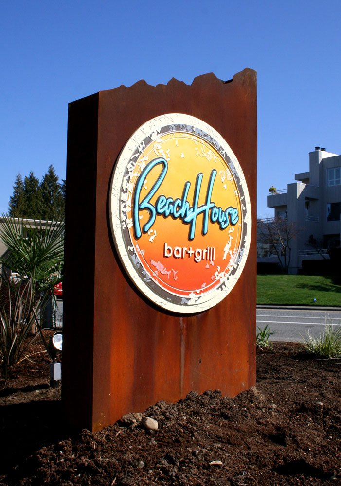
 Pub. Note: Signage is an often overlooked and under-appreciated element of success in retail sales. We asked an expert in the field to spell out the steps toward development of an effective signage component for a retail business of any size and setting.
This is the how the sign-buying process should begin for any business, no matter the size. Define your product and your target audience and then design an environment, including the signs that will appeal to that audience and set the right tone.
3. Sign design, the big picture: Assuming you have done your homework and decided which company you would like to work with on your project, it’s now time to hand things over.
The first step in the design process is to educate the sign company you’ve partnered with. A good sign company will ask you questions about your company and clients. One of the things I have always enjoyed about being in the sign business is the wide variety of people and businesses we encounter—from the local restaurant owner who built his business from the ground up, to the aerospace manufacturer making key components for satellites. Successful signage must work with the existing marketing plan and appeal to the intended audience so understanding your business is an important step in the design process.
While throwing more money at your sign project may not result in the best-looking sign, it’is important to design within the proper financial parameters. Overall size, lighting options and materials all are affected by the budget range, so determining the edges of that range will greatly expedite the process.
The final step is to share your existing visual marketing materials and then get back to running your business. This step will take a small investment of time up front, but it will save exponentially more hours down the road and result in a sign that directly increases sales.
4. Tips from the SBA: It’s not every day that I will give praise to a government-developed document, but this is one of those exceptions. It’s actually an older document in regard to signage, so some the information should be updated, content is excellent. It’s a long read and there is much written here about design best practices, but do yourself a favor though and at least the first three chapters, whether you think you need a new sign or not. You can read it now at What’s_Your_Signage
5. How to buy signage; first contact. You know that old saying, you can’t judge a book by its cover, and the qualifying process helps a sign company take a look under the cover before making any judgements or commitments. I think many in my business simply judge the “cover” of the prospective client and fail to even show up to discuss a project.
Make your cover better. Getting the right sign company to show up can make all the difference and result in a more effective sign at a better price, so how you present your company up-front is important. Here are some dos and don’ts that can help.
Don’t:
- Begin with the question of “how much.” This says you’re all about price and, as a result, you may have a hard time getting people to show up.
- Be ambiguous. If you’re all over the place and confusing, it’s difficult to determine if you’re a good potential client.
- Wait until the last minute. If you wait too long, you will, in the best case, have to spend more in rush fees but you also may not be able to work with the best companies and end up with an ineffective sign design.
- Be vague or misrepresent your budget. This just wastes everyone’s time and creates a difficult working relationship.
- Sout mass estimate requests. Believe it or not, we usually find out when you send out the same request to every shop within a 100 miles. This shows you’re not serious about the design process and will result in a less than desirable sign.
Do:
- Ask about price. Few people know what a sign costs. Conversations about price ranges for various sign types will greatly expedite the process.
- Be clear and prepared. Being able to explain your needs clearly is important. This means knowing what you want your sign to do for you.
- Begin early. An effective design takes time. The entire process, from design to permitting to fabrication and installation, easily can take two months.

- Sign Financing Options. This can be a bit of a catch 22 for many businesses. You need a sign to generate business but you do not yet have enough business to buy a sign. This is where financing can come to the rescueand allow you to purchase a sign that will make your business appear established from Day One.
The best option for financing is to include your signage into start-up or expansion financing, along with other improvements and equipment. In fact, many SBA loans will look for this and want to make sure that you have a plan in place for signage before approving the loan. Begin with a sign budget larger than you think you’ll, need since it’s a lot easier to spend less than you need instead of going back for approval on a larger amount.
An SBA 7a loan for equipment is typically a 10-year loan and you usually can ask for a start-up period with interest- only payments, which will help bridge the gap until cash flow becomes positive. Always double check, but 10-year loans usually won’t have pre-payment penalties. SBA microloans are for amounts of $50, 000 and under and come with higher interest rates but lower up-front fees and are easier to qualify for. If you’re starting a new business, develop a good business plan to show you are well- prepared!
Heading into discussions with a sign shop with pre-approved financing will get you some VIP attention, since it’s obvious you’re ready and able to make a purchase. This will also give you some bargaining power when it comes to price.
Finally, be careful about timing. When applying for loans, ask them when they will need to do a hard credit check. You’want to make sure those credit checks all take place in a short amount of time so your credit appears good to all the lenders.
7. Sign content: Putting up a sign for everyone to see— especially in a high-traffic area—is a fantastic opportunity most business owners recognize and want to take full advantage of. But what will that sign look like? It starts off pretty simple, with a name or logo and oh, how about a tagline? A few bullet points with products is a good idea. Wait, we really need to have our website on there and maybe the phone number. Product logos are important, too since they are highly recognizable. Before you know it, your content looks like a copy of the Constitution and you can’t read any of it from more than five feet away, let alone 500.
Getting the most bang for your buck, however, requires careful design. I’ve talked about effective sign design and this is exactly what I mean—a sign that actually does the job you intended it to. While it may seem counter-intuitive to leave some things off your sign, it will, in the end, make it more effective.
Keep in mind that the average time your sign is viewed by drivers passing by is about five seconds. Then, take into account the need for negative space, that blank area around your content, which should be at least 60% for maximum readability. This leaves you with 40% of your sign for your content. What you place in that area is really important so let’s break down some rules to help you decide what gets cut and what stays:
- What is your overall marketing plan?If you are spending a lot of money on branding and you have a recognizable brand you should use it on the sign as top priority. On the other hand, if your sign is your only form of branding, perhaps what you do should be top priority. Think barber pole, Sushi, Hardware, Used Cars, etc.
- Sign Placement. Signs that are intended to be viewed from the street should follow the “keep it simple” rule, whereas pedestrian-viewed signs can bear a little more content.
- Secondary Signage.Window signs, secondary wall signage,and interior signs are great places to advertise products and continue to establish the character of your store.
- Action!What do you want your customers to do? If your product requires some education, then having them go to your website is a great option, but if setting appointments is your priority then obviously you want phone calls. Placing both your website and phone number on the sign is poor use of space.
The USSC has a great study available on sign legibility and the importance of letter size. You can take a look at it here.
Brian Stoddard is the founder and president of NW signs, based in Monroe, and has nearly 25 years of signage design and fabrication experience. Learn more at www.nwsigns.com.


